It’s no surprise that the brilliant Mark Zuckerberg is constantly thinking of new ways to distinguish Facebook from the other social networking sites out there. Not that he really has to, considering Facebook is still the number one most-used social networking site today, but he does. Usually the changes he makes are small, and only extreme Facebook users notice them.

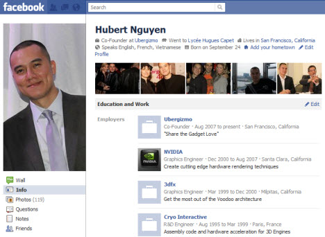
But last night, he unleashed a beast onto the Facebook community: a new layout. But not only a new layout, a new layout that focuses in on your biography. Now, for a social networking site, this sounds like a good idea. But how many times can Zuck and his crew change Facebook and its features before enough is enough?
This new layout, or “new profile” as they like to call it, relies on the importance of your photos. What I mean is, your profile picture is bigger, and under your name now you’ll notice the five most recent pictures of you -tagged by yourself or others.
Now, this – thankfully – does not change privacy settings at all. If your profile is set to only make your profile pictures visible to the Facebook community, then your five most recent profile pictures would be displayed. If your profile only allows your friends to see pictures you post like mine does, then only your pictures would pop up. Simple.
But in between your name and those five recent pictures is a little biography of you. It’s like speed dating your friends. Before you have to scroll down you get to see six pictures of them – profile and five most recent – and you get all of the information from their old “info” page into a little blurb under their name. You get their job, where and what they studied, home and current towns and birthdays.

Facebook just enhanced and quickened your stalking abilities. Now you only need to see the top of the page before deciding whether or not to continue creeping on somebody.
Another new addition to Facebook is sports. When you edit your profile, you can now list the sports you play, the sports teams you root for and your favorite players. That’s pretty cool. “Religion” was changed to “Philosophy” and you can also add which foreign languages, if any, you speak.
So really, in my opinion (and you are free to disagree), it seems as if the new profile has gotten a little more personal. All of your information is front and center, and I think it could change the way Facebook is used as a social networking tool. Instead of it being primarily for drunken people to post Texts From Last Night and stupid but funny pictures, I feel like the new layout would make the site more mature, almost.
I don’t want to say professional, but now if you think about it, the first thing an employer, if he or she decides to search for your profile, will see is your complete biography and a few little snapshots. They don’t even have to click a button to get all that information. It’s like in the Princess Diaries when Julie Andrews says “A picture is worth a thousand words…and you have two.” Well we have six, so we should at least consider that when uploading new photos.

This new layout doesn’t seem too awful. Of course, creatures of habit will complain, and it will take even the most tech-savvy of us some getting used to, but I don’t think this change is a negative one. But what’s next for Facebook? Should Zuck contemplate more features and ways to change it? Let’s wait a little while to see how this change goes, and then contemplate more upgrades.


